Kaiser Permanente: Internal Website Redesign
MHCID Capstone Project: Kaiser Permanente- Southern CA Imaging & Strategy Department
Tools: Figma, Adobe Illustrator, Adobe XD, Adobe Photoshop
Team: 5 members total
My Role: Project Manager, Designer, & Supporting Researcher
Over 30,000,000 people are admitted to the hospital each year in the United States alone. Ensuring that the proper hospital equipment is safe to use and in the right place at the right time is critical. We partnered with Kaiser Permanente’s Southern California Medical Imaging Technology and Informatics department to help create a more efficient inventory management tool for hospital equipment across the entire Southern California region.
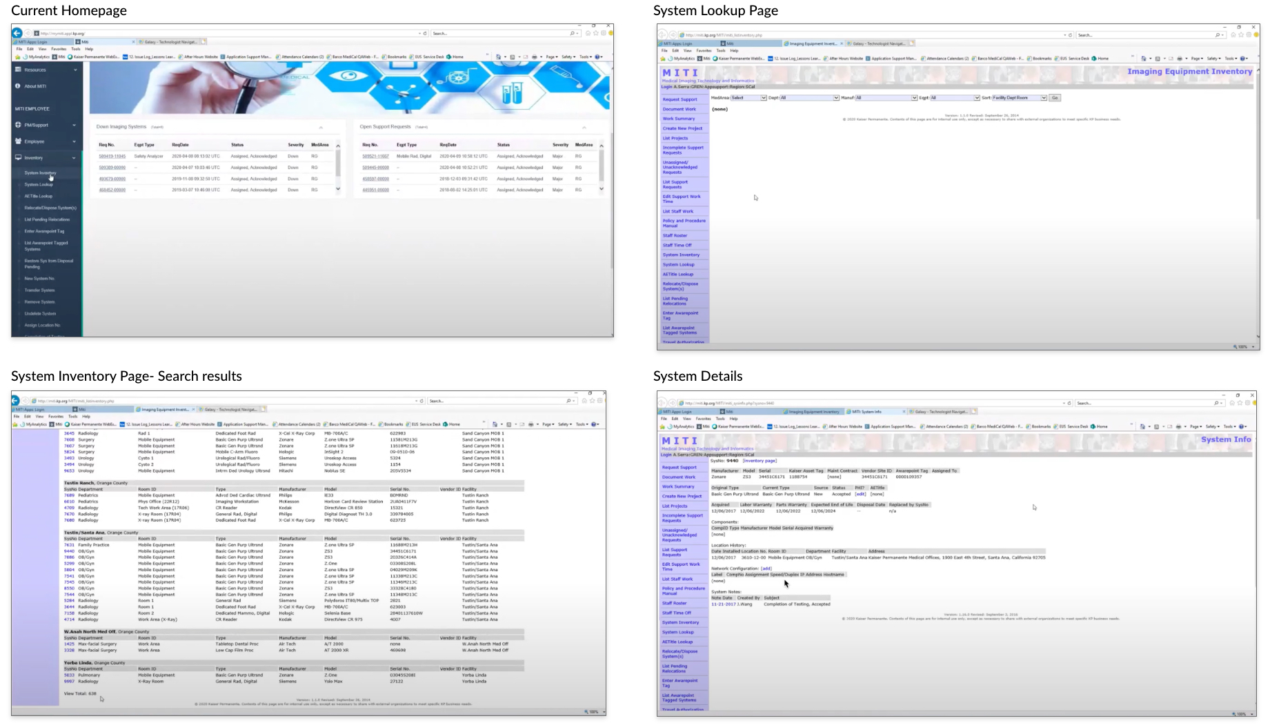
Problem:
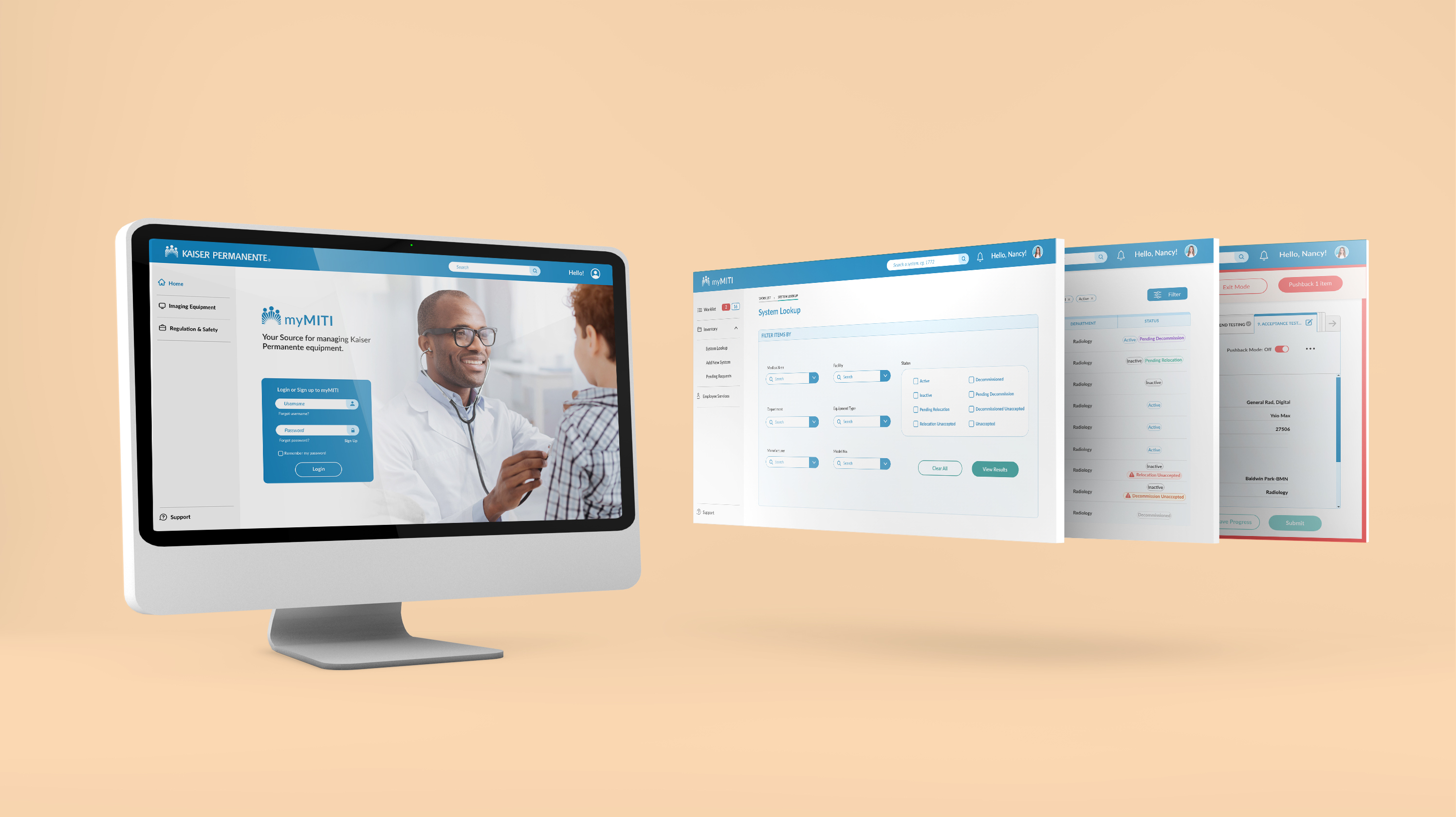
Solution:
Process
We followed the Design Thinking methodogy and started the process with research to gain an understanding of our user’s needs. Through academic research, stakeholder, and user interviews, we were able to define our problems and opportunities. As we moved into our ideating phase, we explored numerous design solutions, and then prototyped and tested our solutions through each step. The iterative process allowed us to test, prototype, and refine our prototype.
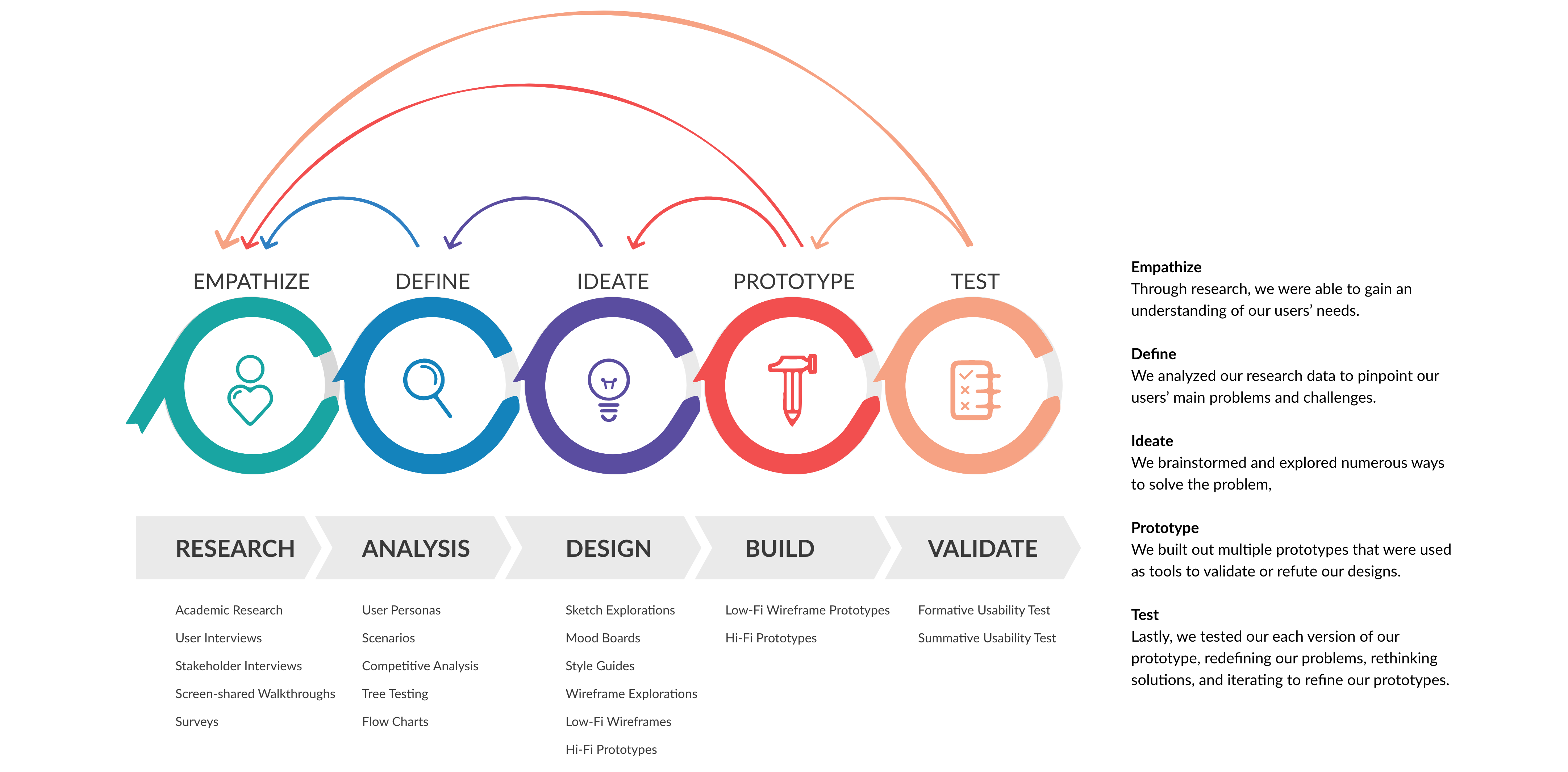
Research:
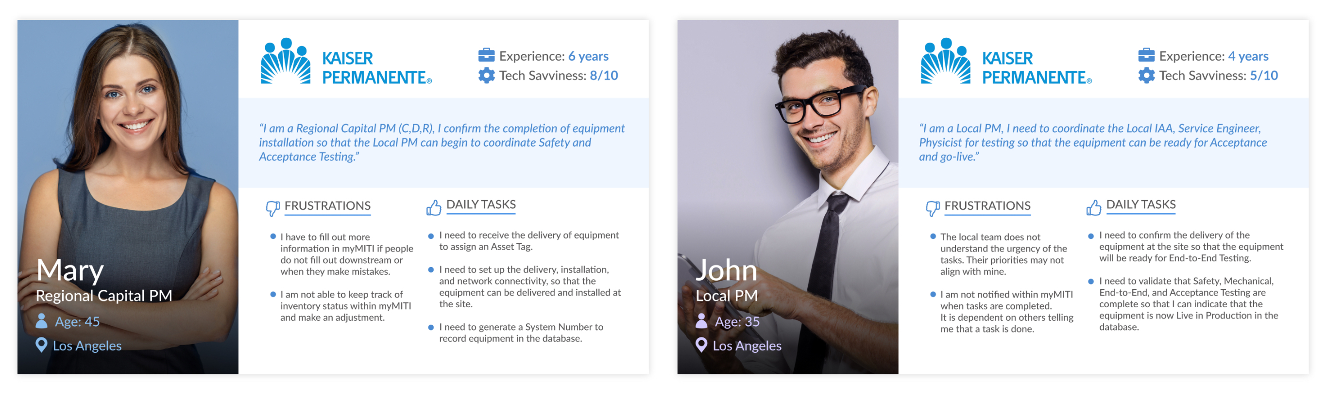
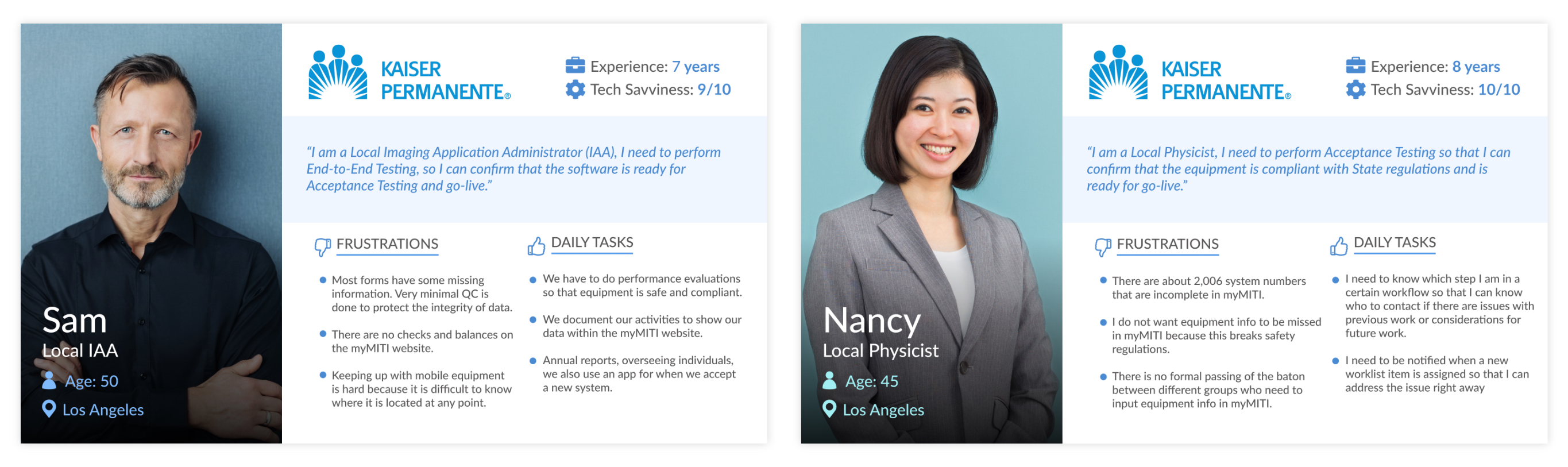
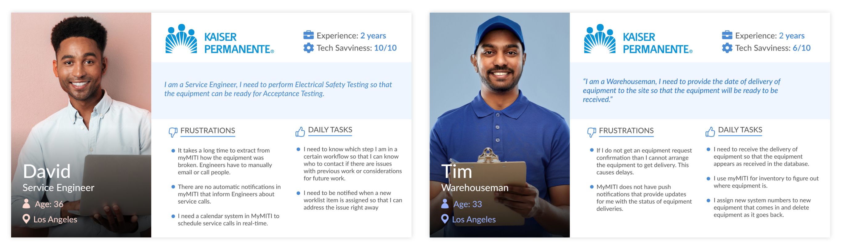
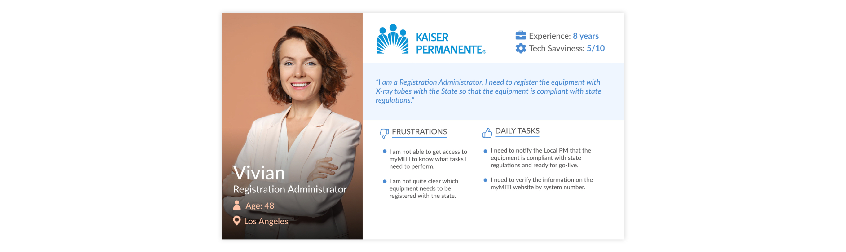
We interviewed a variety of people in different job roles via Microsoft Teams. The insights gathered from these interviews were used to inform our personas, storyboards and scenarios.
A sample of Kaiser employees participated in the tree-test study. This study aims to verify the expectations of our clients and stakeholders regarding the optimal organization of the website.
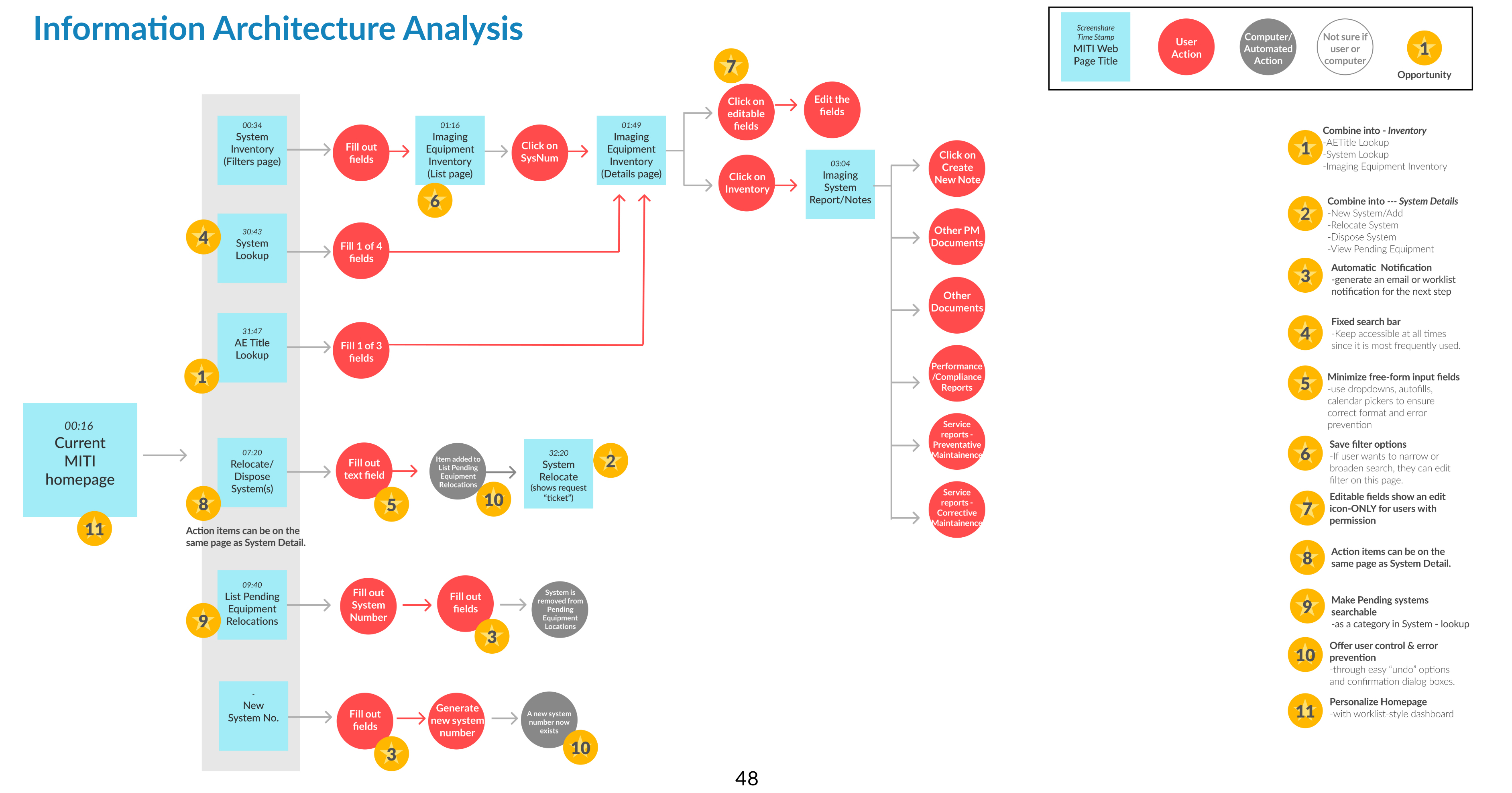
A light competitive analysis-style activity was used in order to validate current design decisions and verify priority items. The team examined relevant applications and websites that currently implement workflow and data management functions. We then mapped out the curret site with opportunities for improvement.
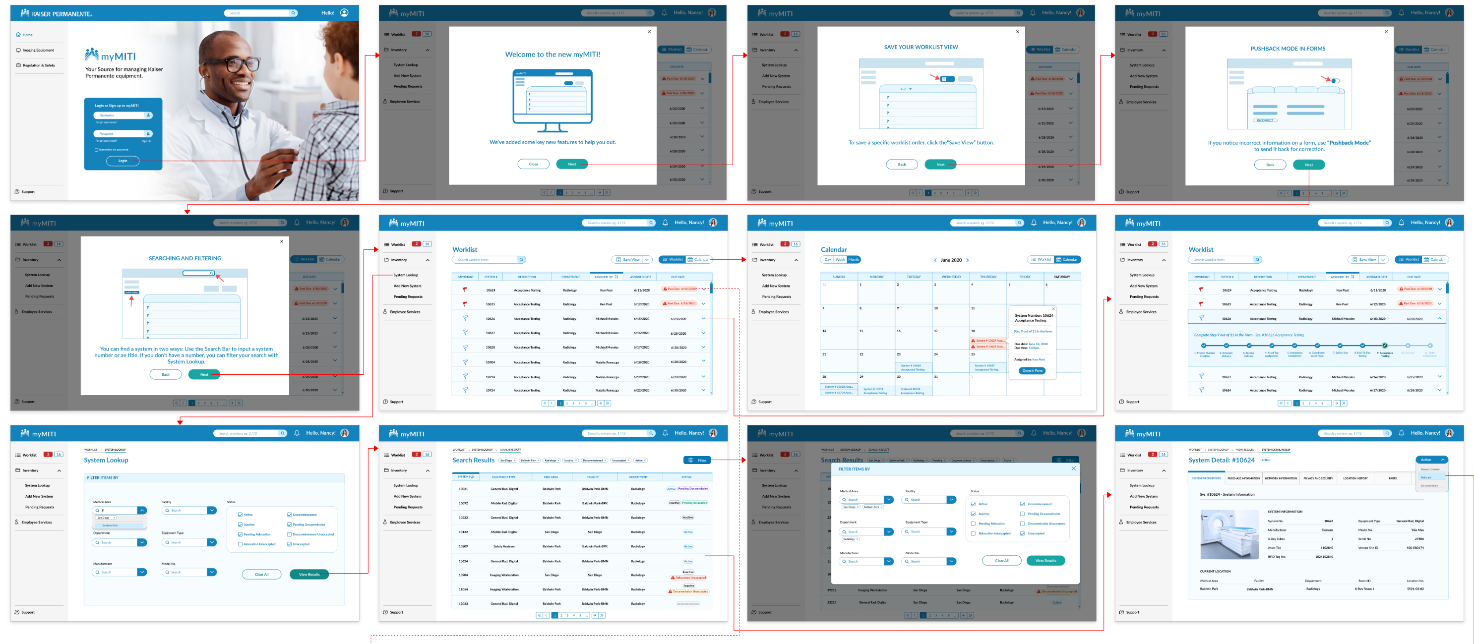
Once we had a clear understanding of the website functionalities, we made a flow chart of a single task . This helped our team have a high-level overview of the processes on the myMiti page.
Design
With research and analysis as our foundation, we were finally ready to begin the highly iterative design process. We explored as many different solutions as possible in a short amount of time.
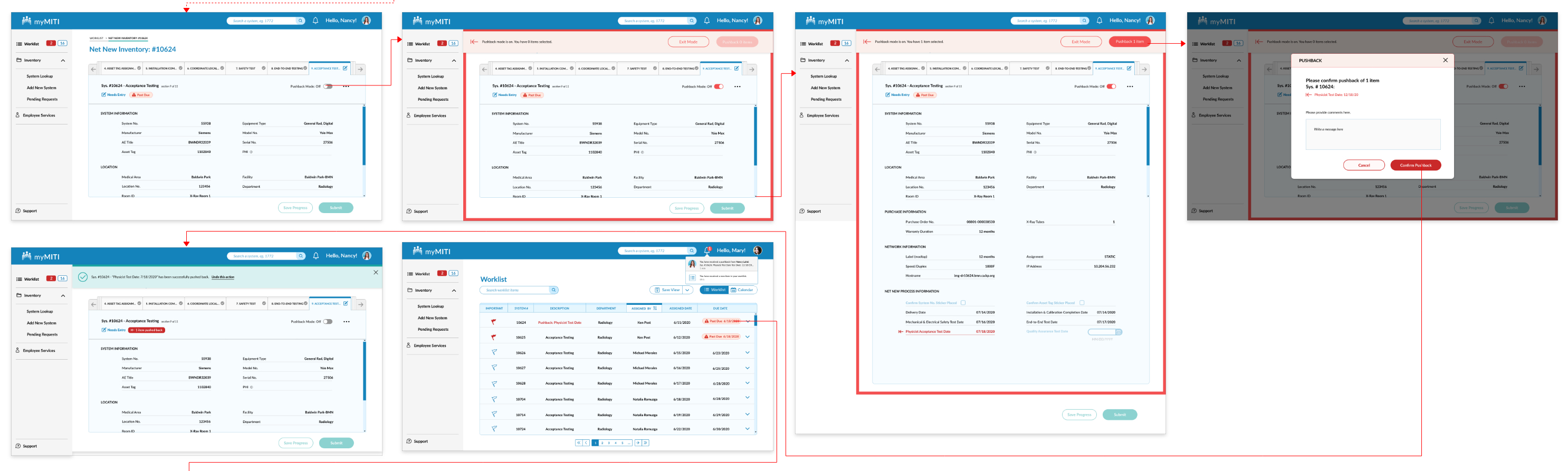
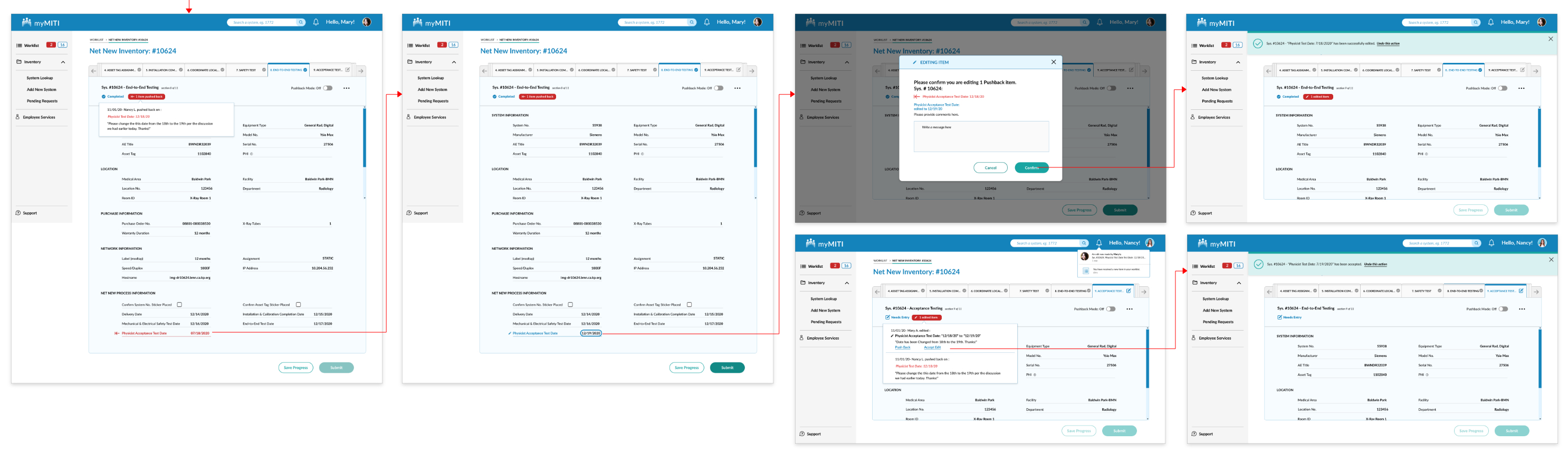
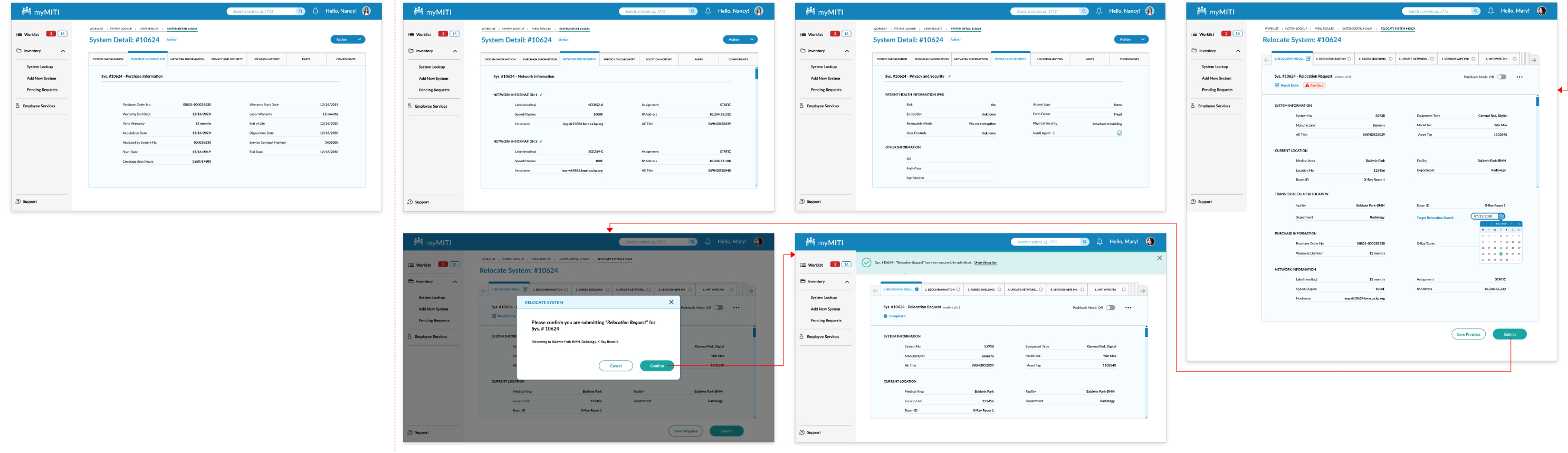
Our final deliverable was a desktop prototype that focused on four main flows;
Prototyping & Testing
The study was intended to evaluate and identify potential issues with the new features and designs. A sample of 9 Kaiser employees participated in this remote study, and were given a set of four core tasks.
These tasks were identified over the course of the project as key workflows that end users would be completing on the myMITI website. We used the platform Validately.com to conduct the test.
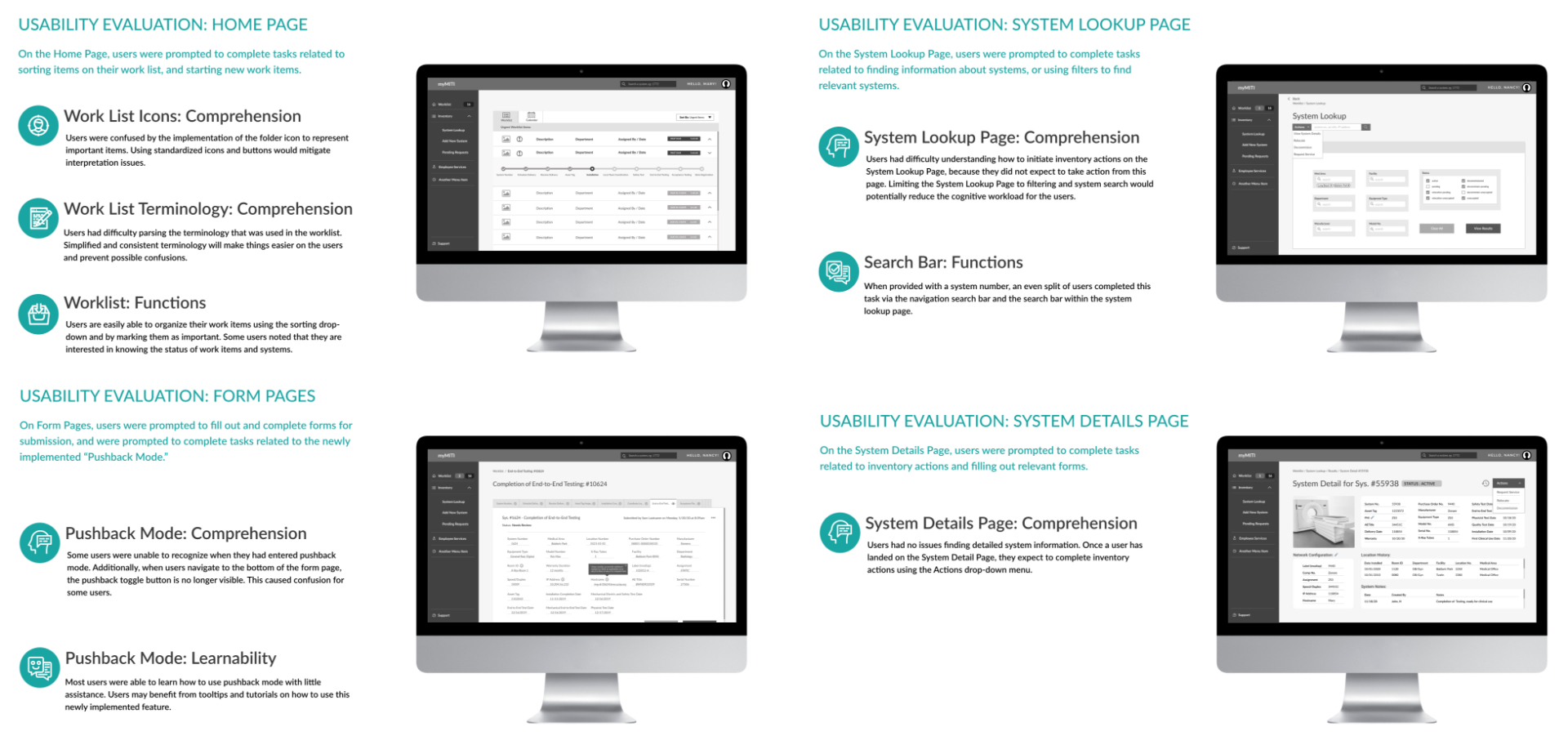
Based on the results gathered in the formative usability evaluation, there were some key insights that needed to be verified. The survey questionnaire was distributed through google forms to 15 Kaiser employees. Based on the results, the team was able to steer the designs in the right direction. The followup survey was deployed to dive deeper into the following topics:
We implemented a final usability evaluation through validately.com to evaluate the adjusted designs and implementations. At this stage, the research goals were to evaluate the perceived usefulness, clarity and general usability. Using a combination of stakeholder feedback and the results gathered in the formative evaluation and followup survey, a finalized prototype was completed. This asset was used for the final usability evaluation. Users were given a set of four core tasks:
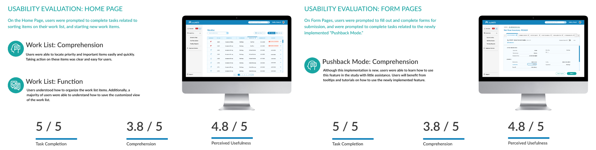
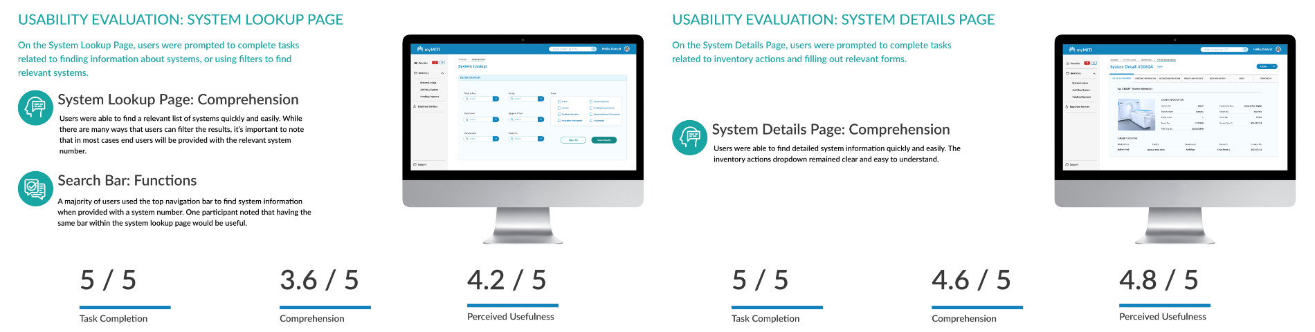
Our goal was to take Kaiser’s internal website and make it functional, intuitive, and simple to use. Our final usability test showed positive feedback: Our data showed that users had a 100% task success and completion rate for all four core tasks, with perceived usefulness. However, we found that there was some opportunities for improvement in helping users with comprehension of the new features.
Conclusion
Our final prototype with Kaiser resulted in positive feedback. Their developers have started to work on putting our designs into production. The new site will be used and implemented across all of the Kaiser Permanente Locations in Southern California.